Case study · Mapp Digital · 2020–2021
An enterprise platform, designed on purpose.
Senior UX/UI Designer on the redesign of Mapp Digital’s customer engagement platform, the tool its clients use to reach customers by email, SMS and push notification. Research, information architecture, a new design system and redesigned workflows, from the first interviews to hand-off.
- Role
- Senior UX/UI Designer
- Company
- Mapp Digital · London, full-time
- When
- Sep 2020 – Jun 2021
- Status
- Designed, tested and handed to engineering

Overview
Built by engineers, for a decade. Then designed.
Mapp Digital is a large marketing technology company, in the same space as HubSpot. Its engagement platform lets marketing teams build campaigns and send them across email, SMS and push. It had grown for years without a dedicated designer, and it showed: inconsistent screens, workflows that took more steps than they should, and a steady stream of support tickets about the basics.
I joined as the platform’s first dedicated UX/UI designer. The brief was to make it easier to use and consistent across the product, and to leave behind a system the company could keep building on.
Research
Users told us where it hurt.
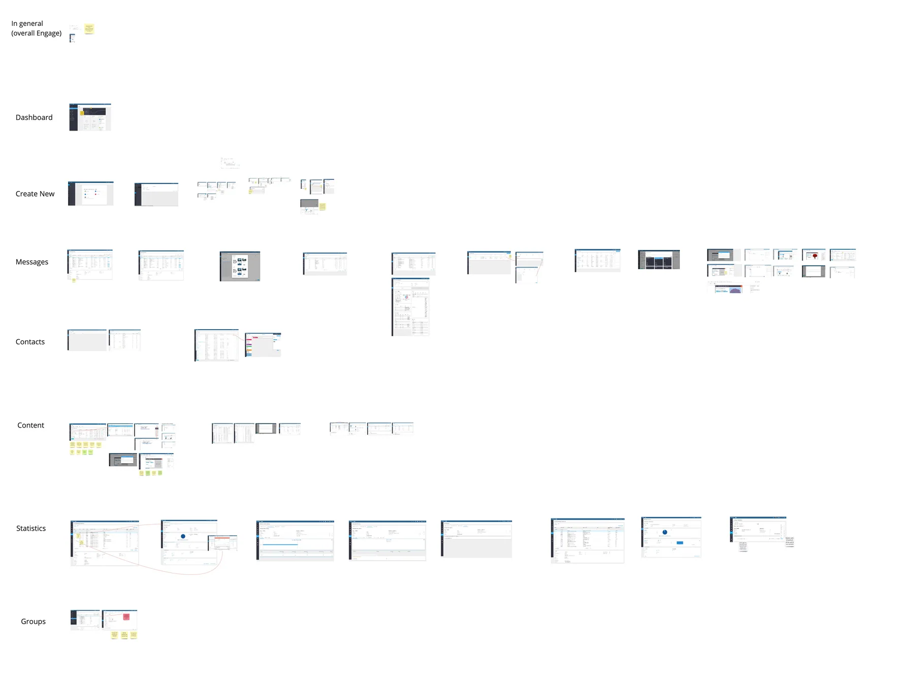
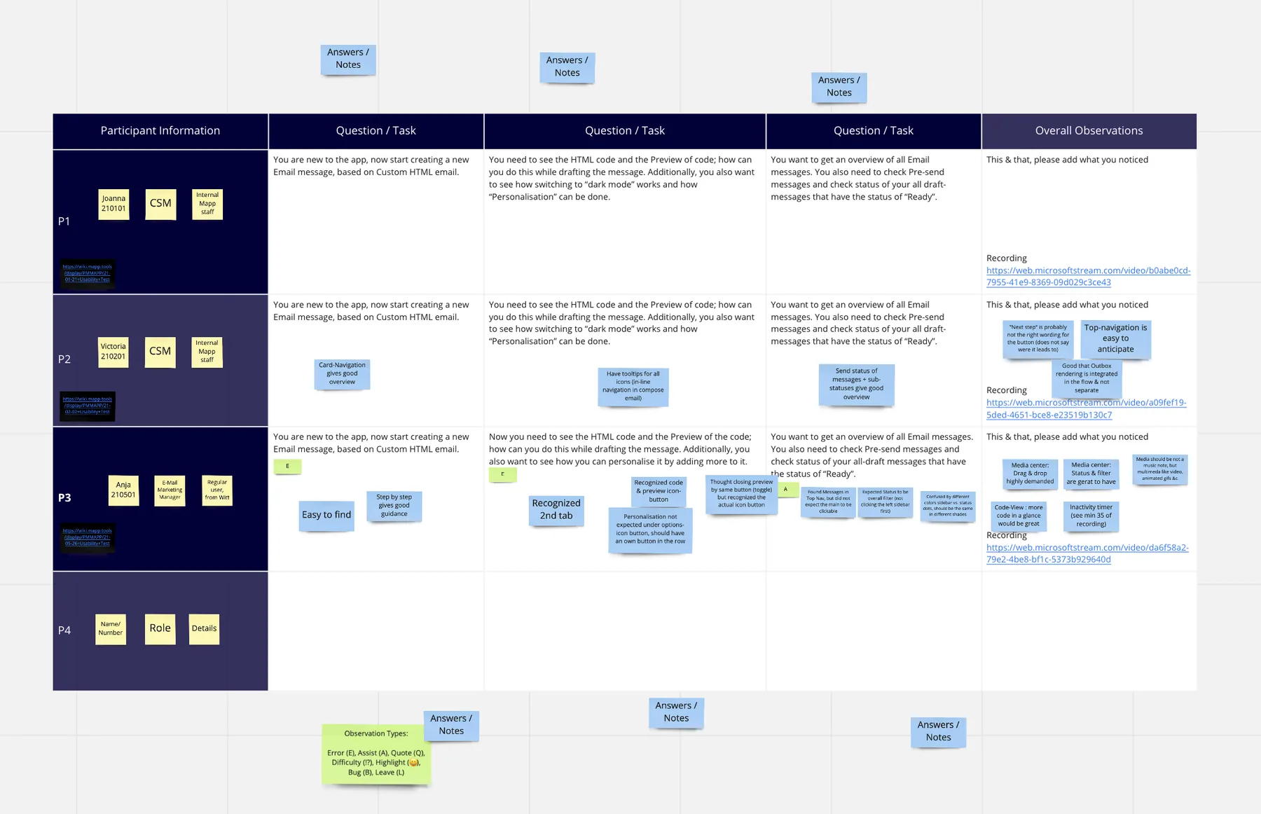
Interviews, surveys and remote usability tests with the people who used the platform every day gave the redesign its priorities. Three findings set the agenda.
- 80%
- of users disliked the sidebar navigation.
- 79%
- found the session timer frustrating.
- 78%
- found creating a message overly complex.
My part
Nine months, research to hand-off.
Research and testing
User interviews, surveys and remote usability tests, first to understand where the platform got in people’s way, then to check the new designs against the same tasks.
Information architecture
Restructured how the platform is organised so that the common journeys, from finding a message to sending one, follow the order people think in.
Redesign and design system
Led the redesign of the interface and built a new design system behind it, so every screen shared one set of components, colours and rules.
The redesign
Three fixes for the three biggest complaints.
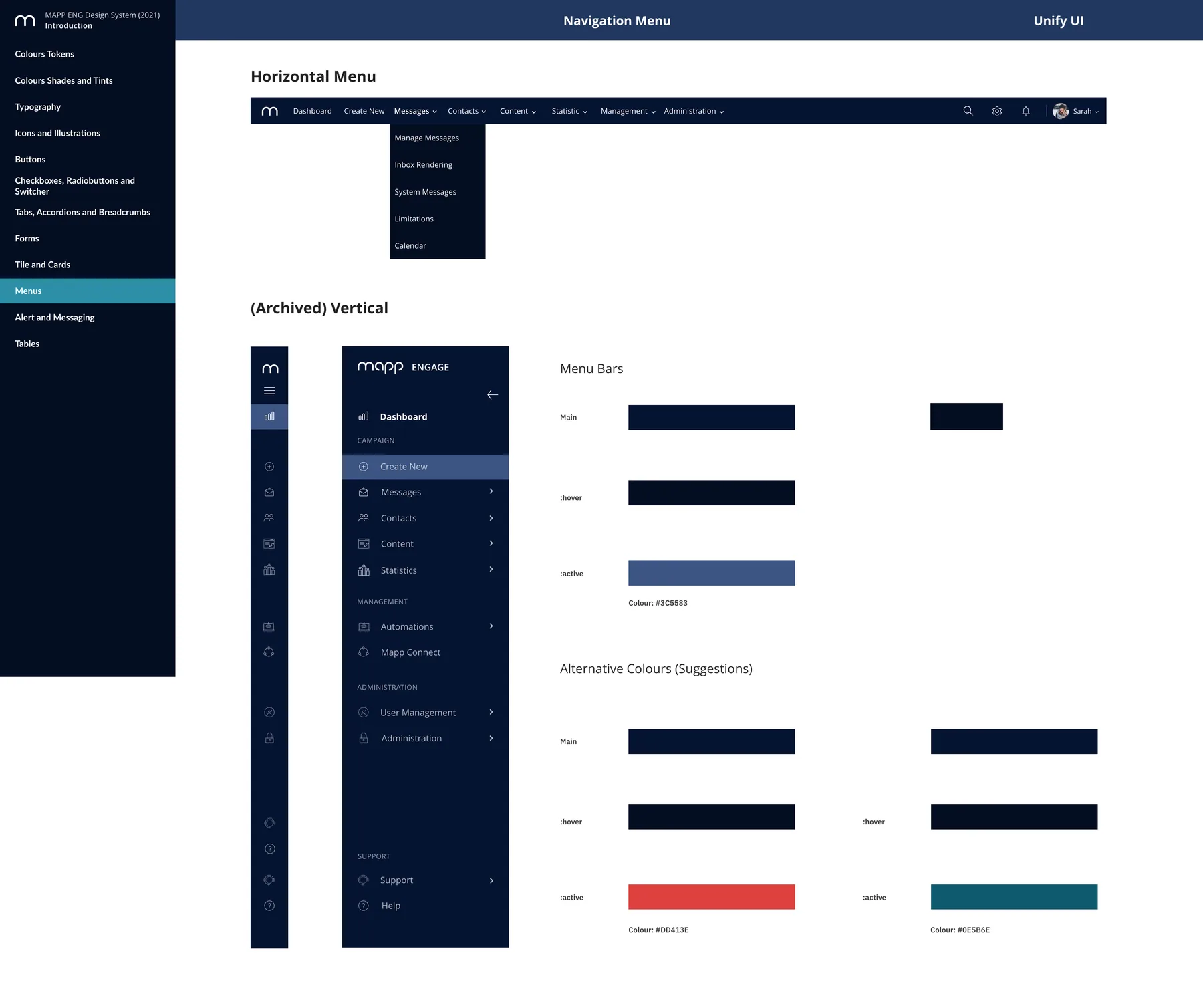
Navigation that gets out of the way
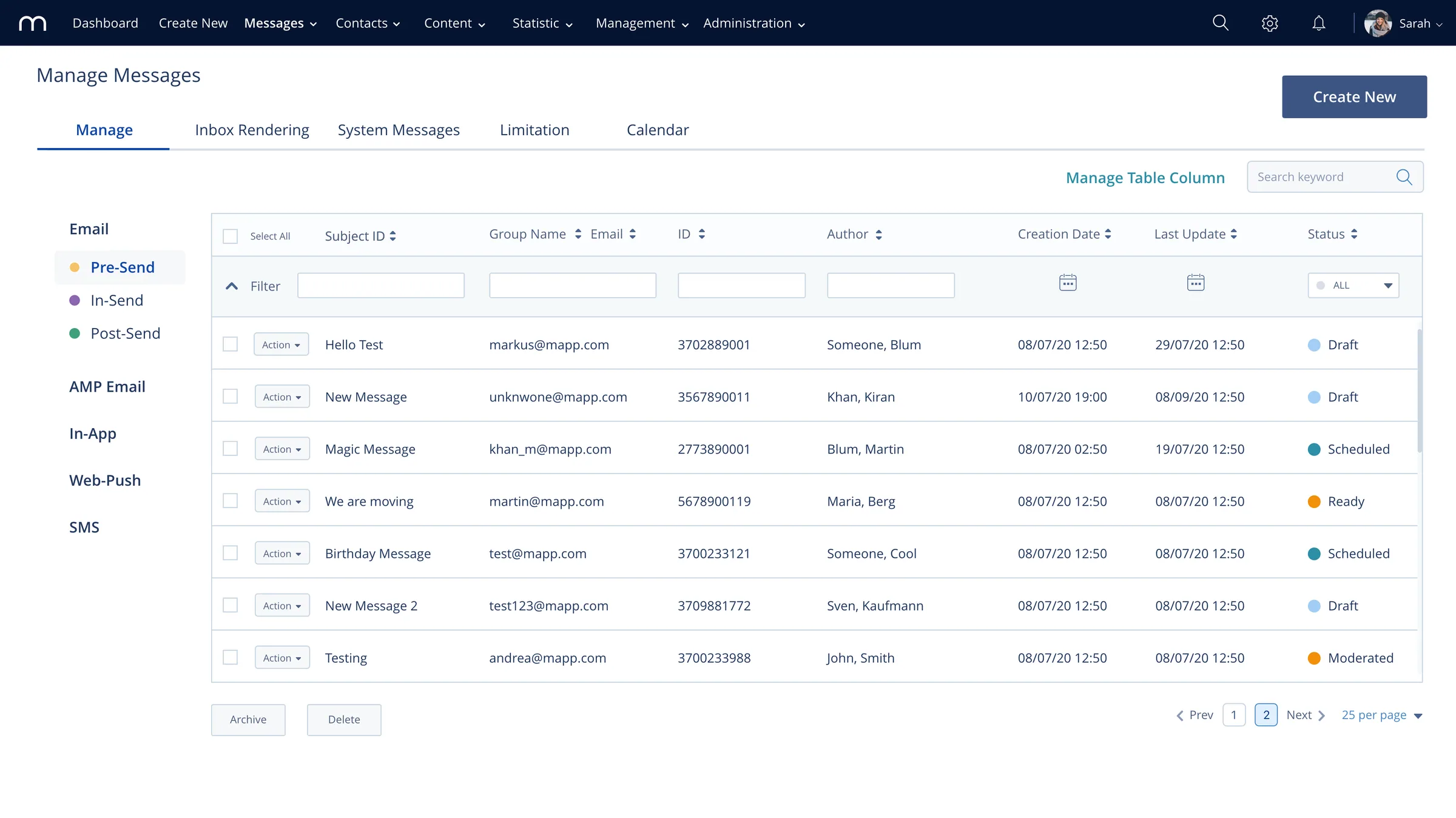
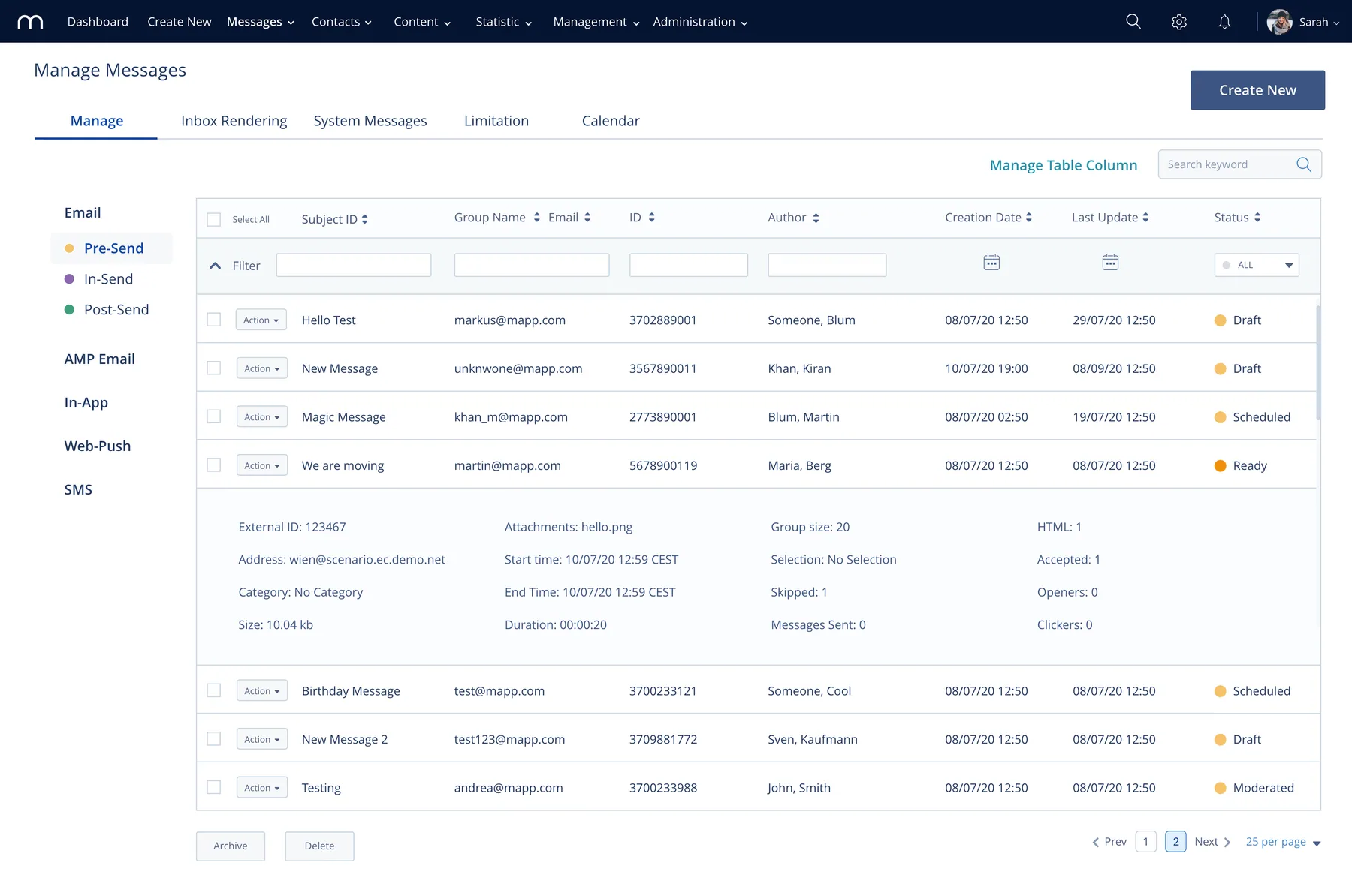
The sidebar that four in five users disliked was reworked around the tasks people came to do. The message dashboard was rebuilt with clear status for drafts, scheduled, sent and moderated messages, so the state of every campaign is visible at a glance.
Message creation, straightened out
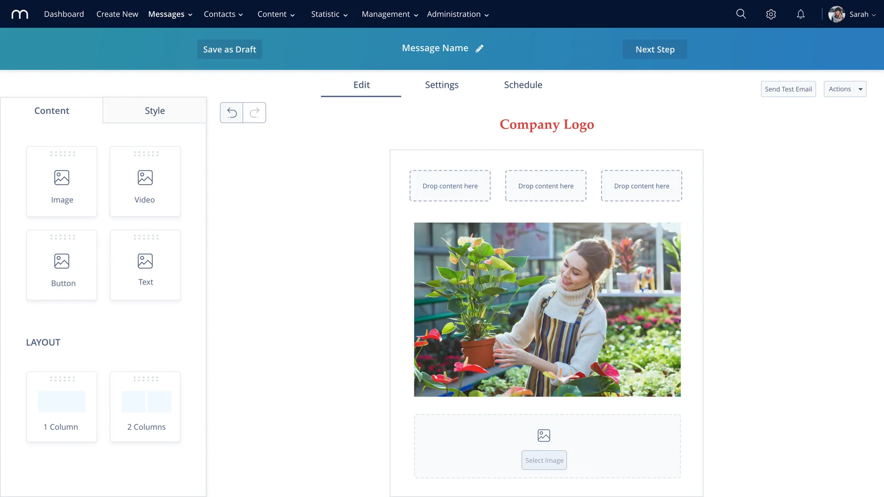
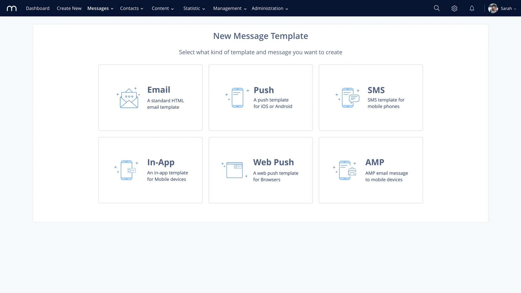
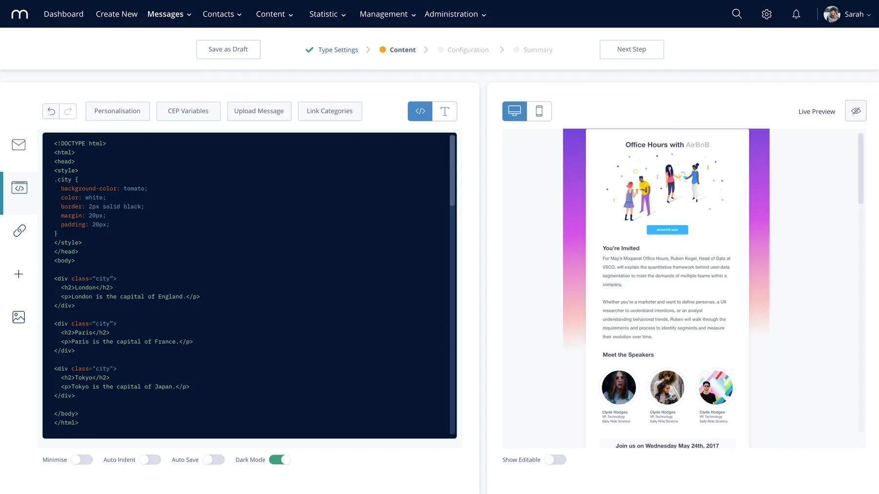
The message creation flow gained a clearer visual hierarchy and a simpler path from start to send. The new email composer uses drag and drop and keeps the canvas uncluttered, so building a campaign feels like one task rather than a dozen settings.
No more surprise log-outs
Instead of silently ending a session, the platform now warns people before it times out, so work in progress isn’t lost.
Design system
One set of parts for every screen.
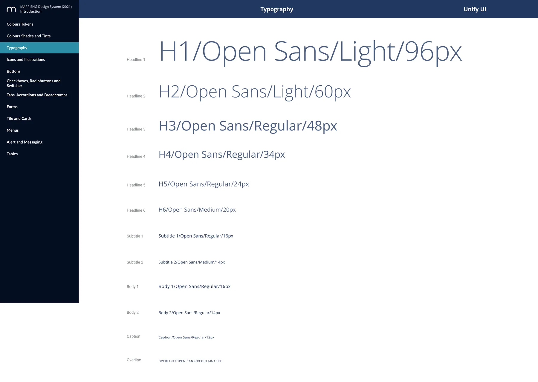
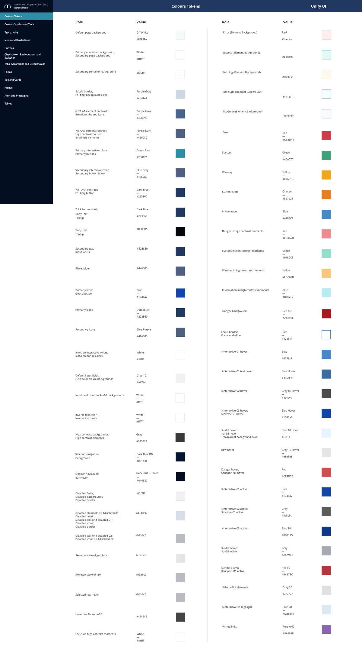
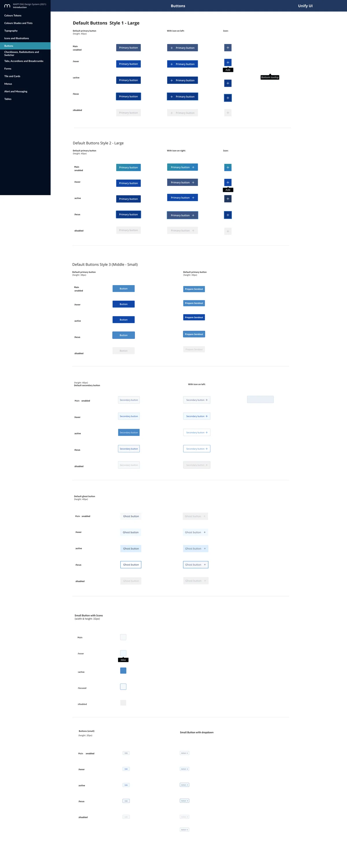
The inconsistency people noticed was a symptom: each screen had been built on its own. The new design system gave the platform shared components, type, colour and spacing, and documented how they behave, so new features could be built consistently without a designer checking every one.
Outcomes
Clear, easy to use, and backed by the company.
- 100% satisfaction in testing
- Every participant in the prototype tests rated the new design positively, with a usability score of 93 out of 100.
- Fewer support tickets
- The problems that generated the most tickets, navigation and message creation, were the ones redesigned first.
- One system for the whole platform
- The design system gave engineering and product a shared language and became the foundation for the UX work that followed.
- Support across the company
- Research findings and test results won backing from teams beyond product, and made the case for dedicated design going forward.