Case study · MentorCity · 2024
Social learning, redesigned end-to-end.
Lead Product Designer on the MentorCity v2 release — a new social-networking layer on top of a platform-wide UX, IA and design-system redesign. Direct line to the CEO, hand-off to engineering, bilingual English / French throughout.
- Role
- Lead Product Designer
- Client
- MentorCity
- Year
- January — June 2024
- Status
- Shipped · v2 release
Overview
A learning product, with a social spine.
MentorCity is a B2B mentorship and learning platform — the team approached me to consult on a new social-networking feature that would let users interact, share ideas, exchange knowledge, and enjoy the networking side of learning, not just the lessons themselves.
What started as one feature became a v2 release. While the social layer was designed, the platform’s existing IA, forms, and design system were rebuilt around it — so the new surfaces had something coherent to land on.
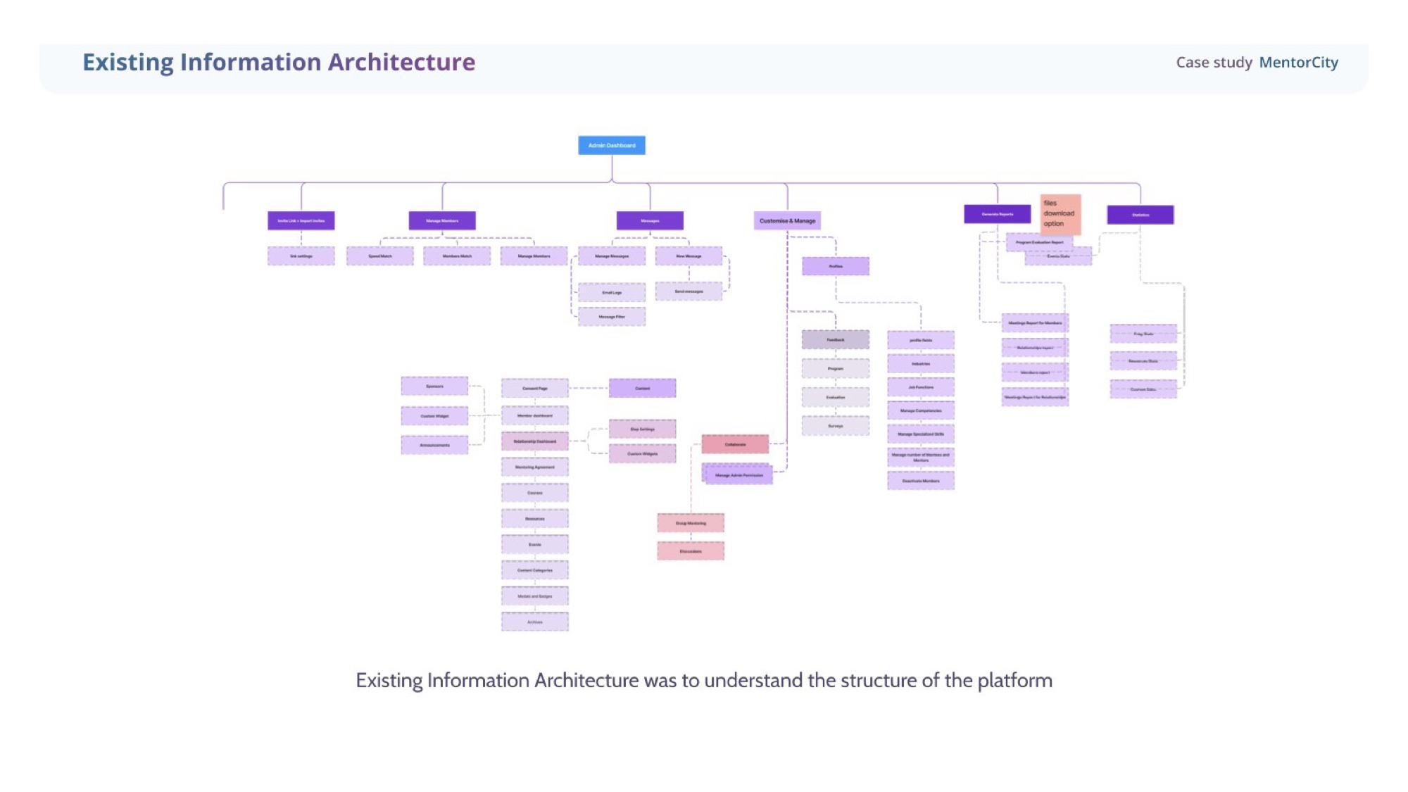
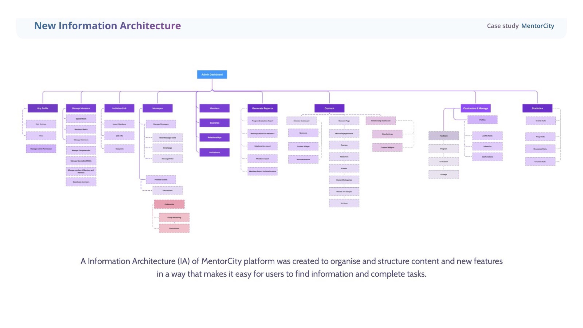
Information architecture
Mapped the existing structure before changing it.
Audited the existing IA end-to-end first — every entry point, every navigation choice, every place a user could get lost. Then rebuilt it around four destinations the social layer could actually live in: Explore, My Spaces, Courses, Resources.
Approach
Four moves, six months.
- 01
Audit the structure
Started by mapping the existing information architecture end-to-end. The platform had grown organically; the existing IA hid the work people came to do. New IA reorganised content around outcomes — Explore, My Spaces, Courses, Resources — and surfaced the social layer as a first-class destination, not a tab buried under Settings.
- 02
Talk to real users
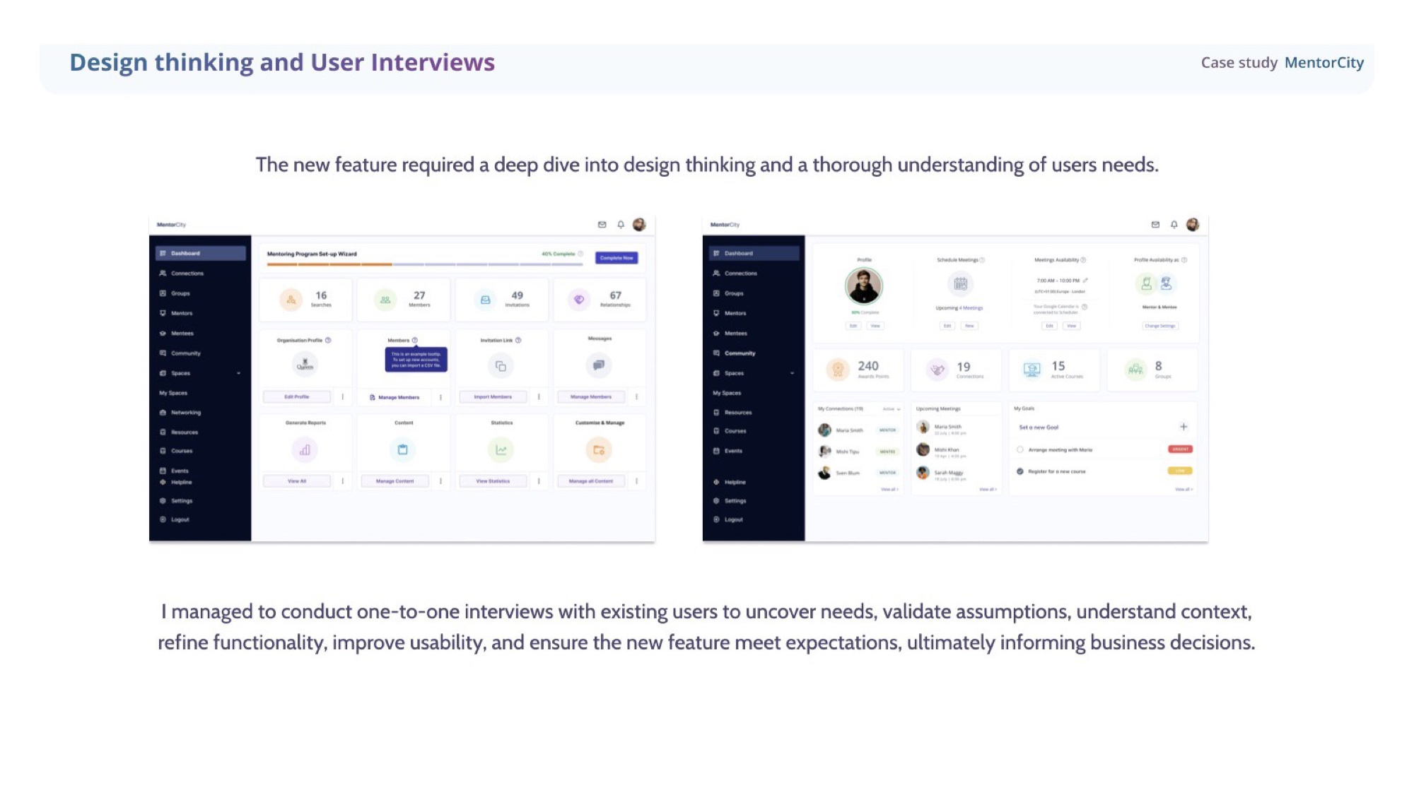
Conducted 1-2-1 interviews with existing mentors and mentees alongside surveys. The new social feature was not a brief from the CEO alone — users themselves were asking for a way to share ideas, exchange knowledge, and stay connected between sessions. Interviews validated assumptions, refined functionality, and informed business decisions.
- 03
System first, screens second
Updated the design system before opening Figma for the first screen. Tokens, components, form patterns, and the bilingual EN / FR architecture all defined upfront so every new surface launched on the same component grammar and the developer hand-off was a contract, not a guessing game.
- 04
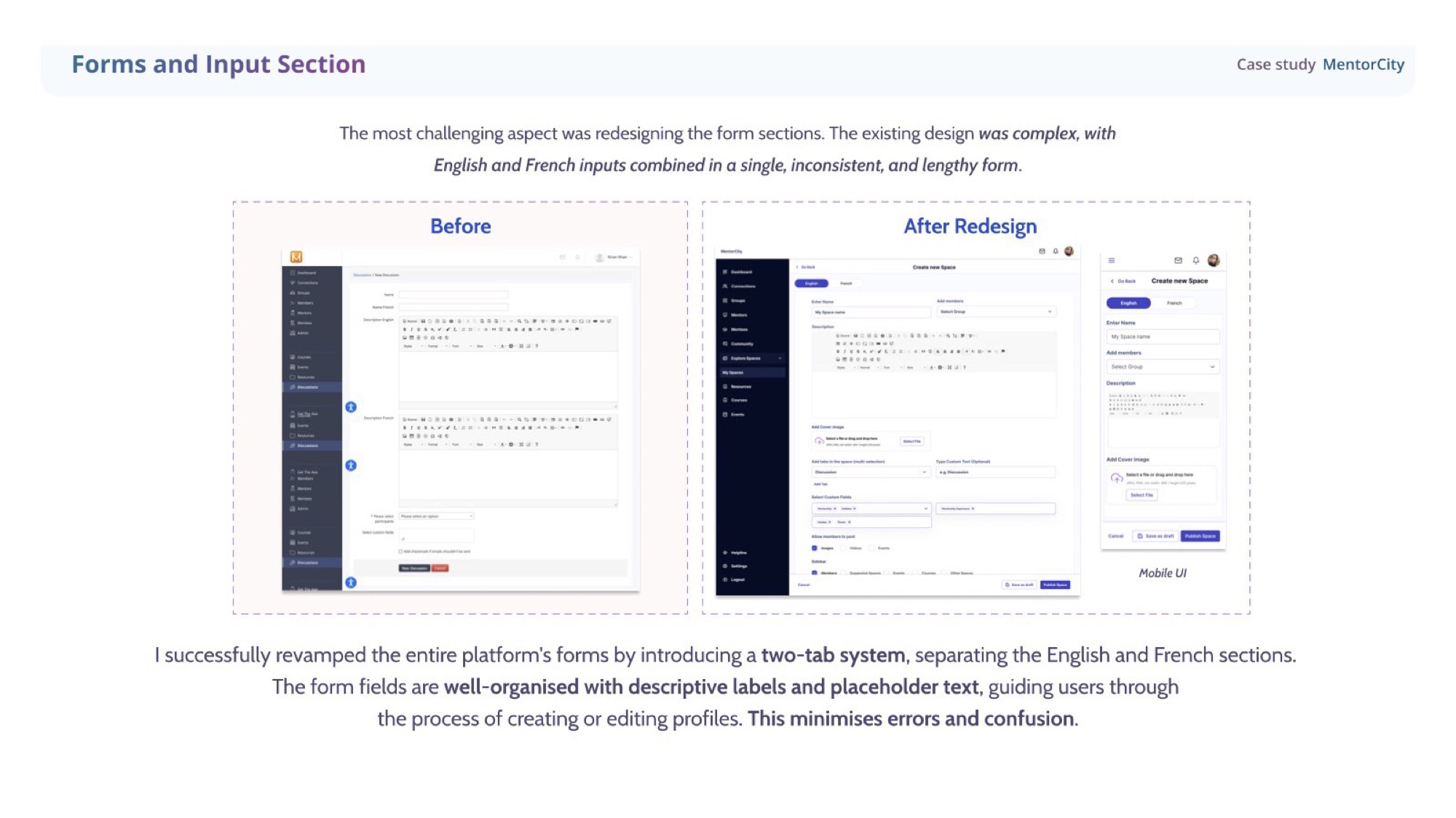
Redesign the friction points
The platform's biggest existing pain point was forms — long, inconsistent, mixing English and French in one stream. I split them into a two-tab system, restructured Manage Profiles into three clear categories, and redesigned Resources around a search-first hierarchy. The new social features sat on top of a platform that finally felt coherent end-to-end.
Research & interviews
Designed with users, not at them.
Ran 1-2-1 interviews with existing mentors and mentees alongside surveys to uncover real needs, validate assumptions, refine functionality, and improve usability — ensuring the new feature met expectations before a single high-fidelity screen was drawn.
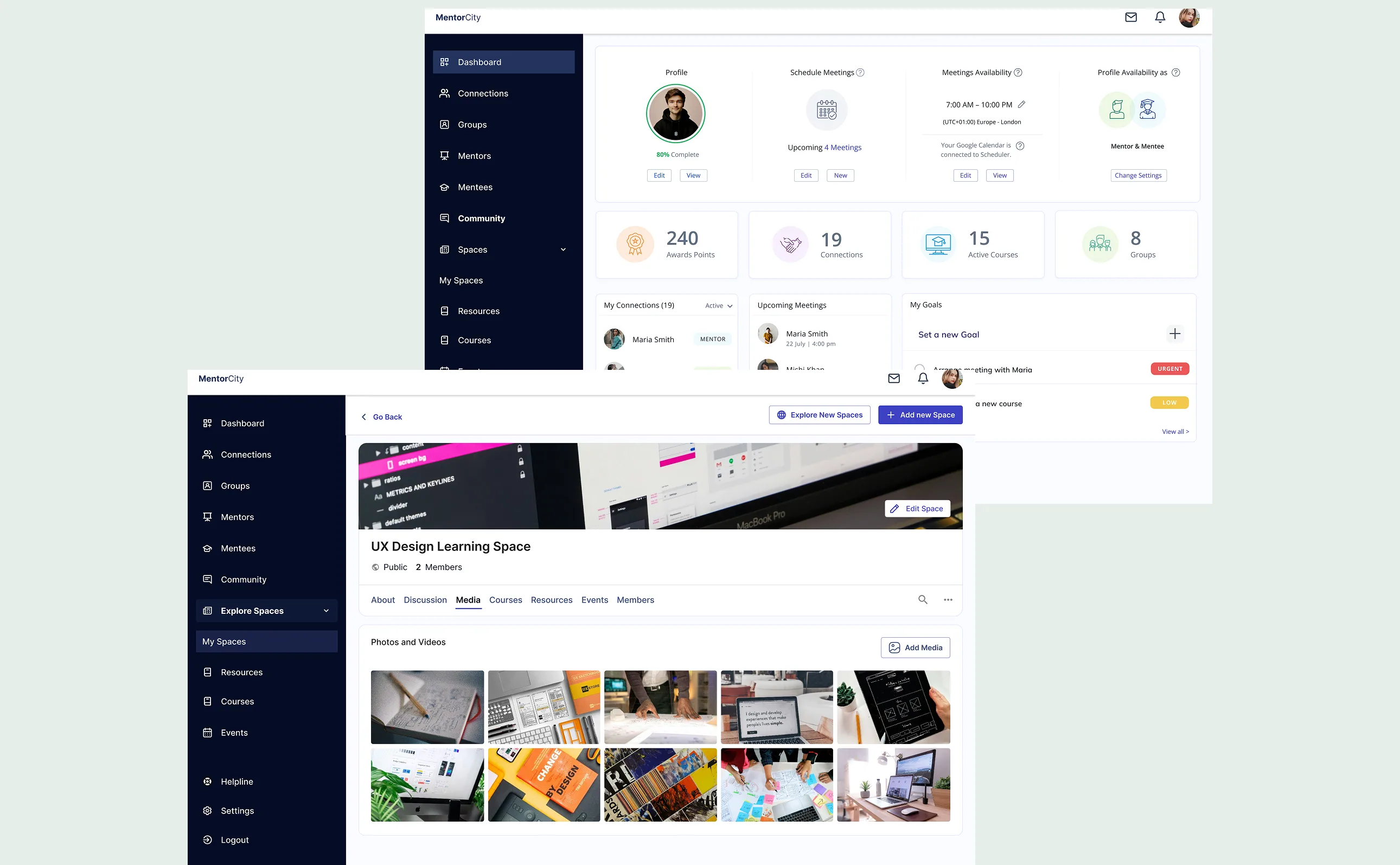
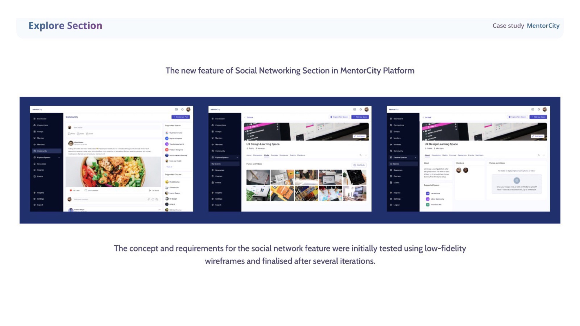
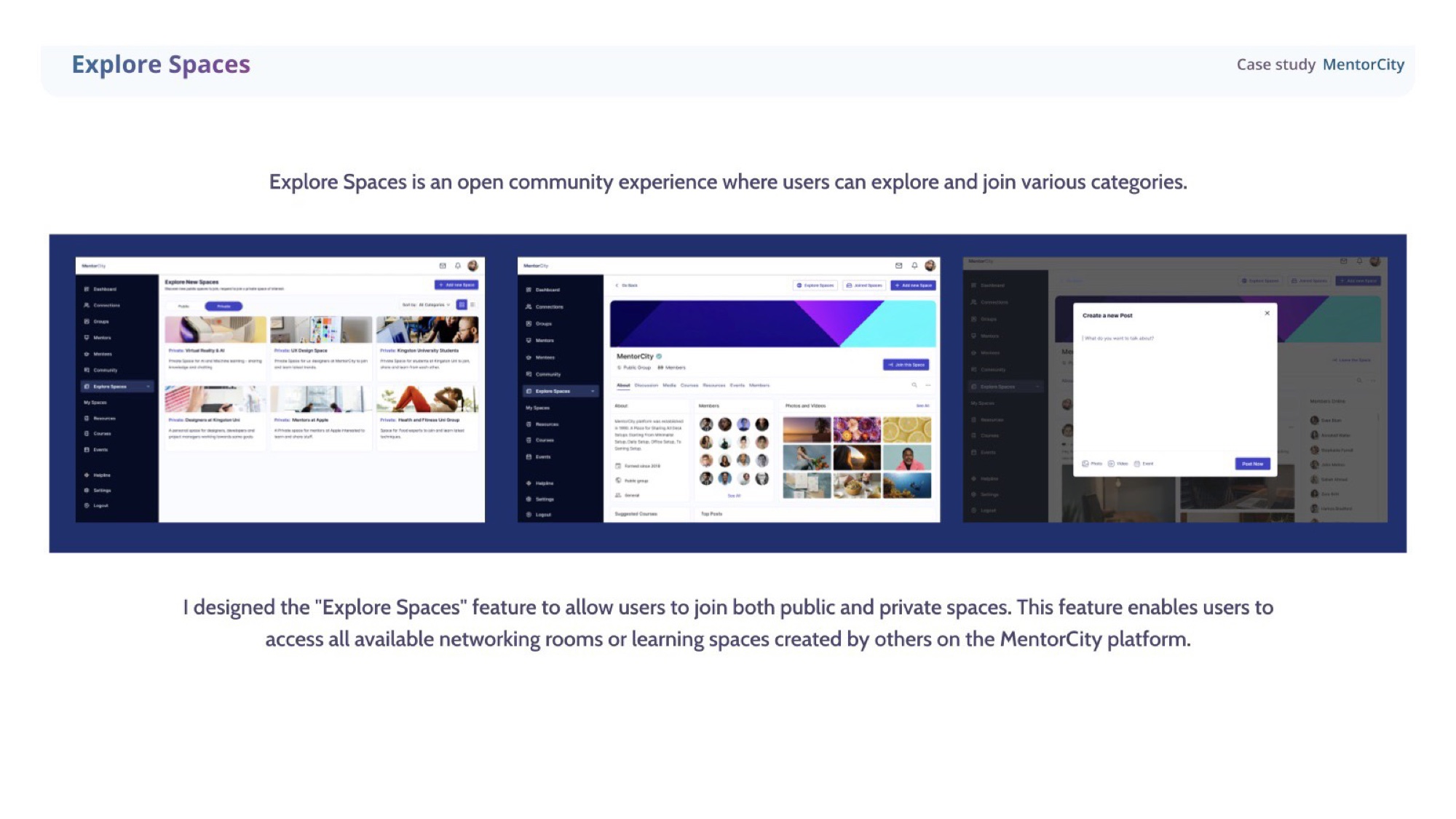
Explore Spaces · social layer
Networking, built into the product.
Wireframed and iterated the social-networking section, testing low-fidelity concepts before committing. The result is Explore Spaces — an open community where users can browse and join public or private spaces across categories like UX Design, AI/ML, and university or company groups.
My Spaces · ownership
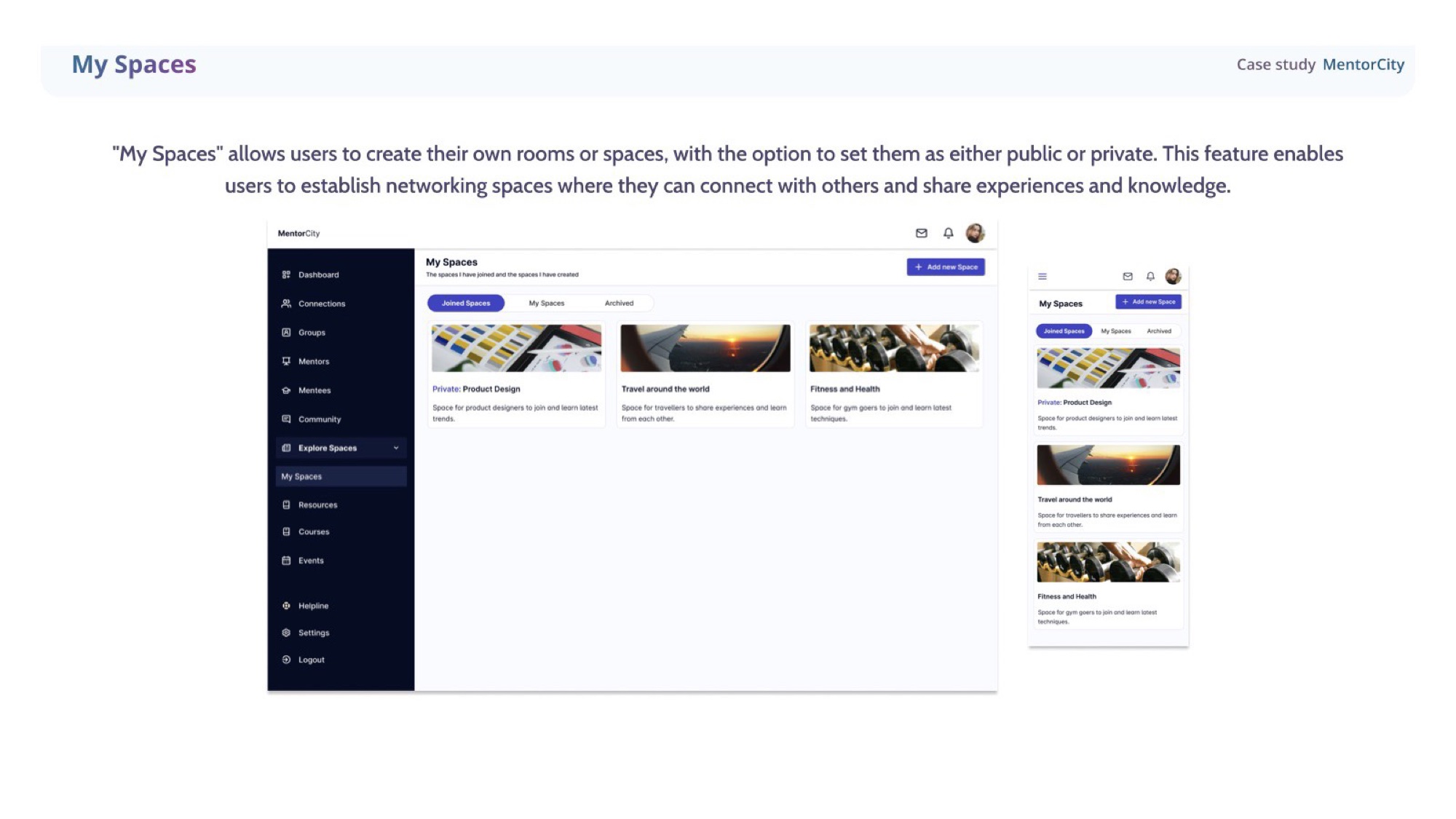
Spaces users can call their own.
My Spaces gives users the ability to create their own rooms — public or private — to connect with others and share experiences and knowledge. Ownership baked into the social layer from day one.
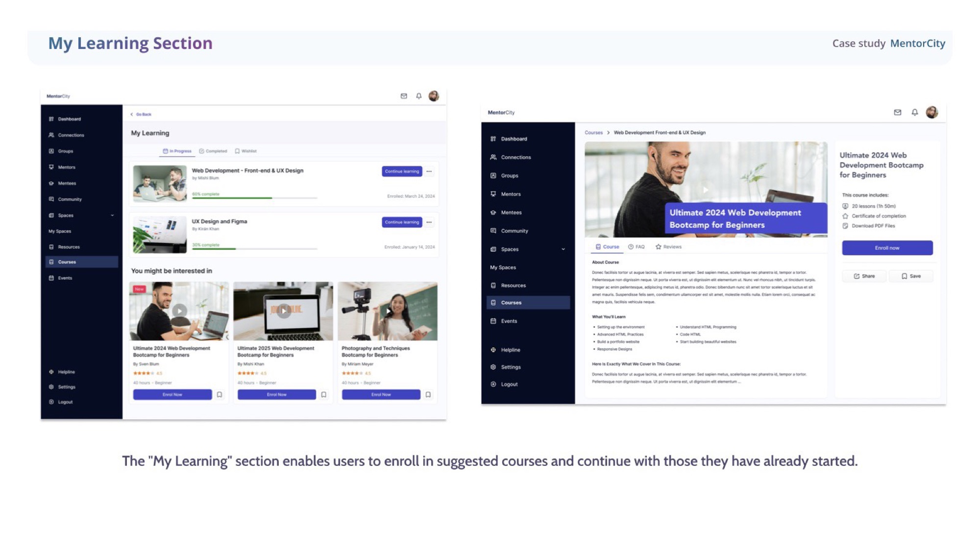
Courses & My Learning
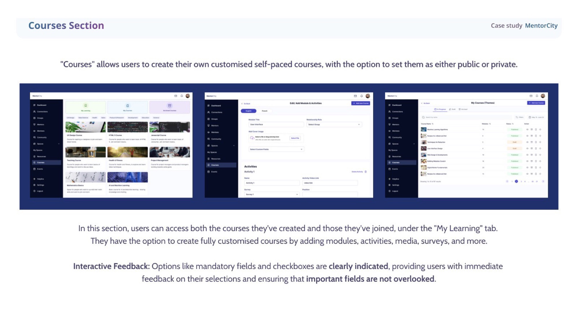
Self-paced, but never aimless.
Users can author fully customised, self-paced courses — modules, activities, media, surveys, the lot — and keep them public or private. The My Learning tab consolidates suggested courses and the ones already underway, so users always know what to come back to.
Forms · before / after
Bilingual forms, finally finishable.
The hardest piece of the redesign. The existing forms mixed English and French inputs in a single, inconsistent, punishingly long surface. I introduced a two-tab system cleanly separating the two languages, with descriptive labels, placeholder text, and clear mandatory-field indicators throughout — error states designed out of the experience before they could happen.
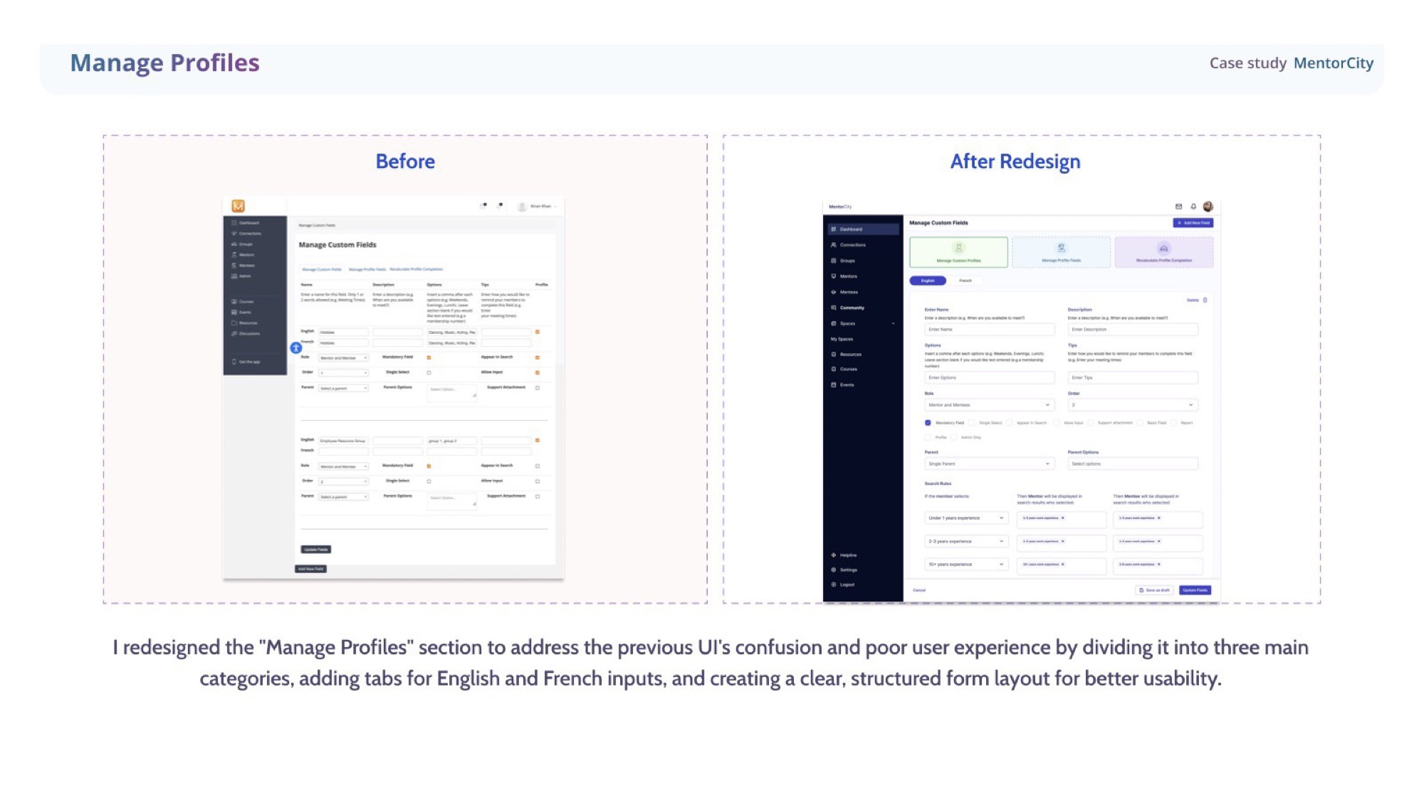
Manage profiles
Profiles you can actually manage.
The previous UI for Manage Profiles was a wall of fields. Restructured into three clear categories, with EN / FR tabs and a deliberate form layout — settings became navigable, not survivable.
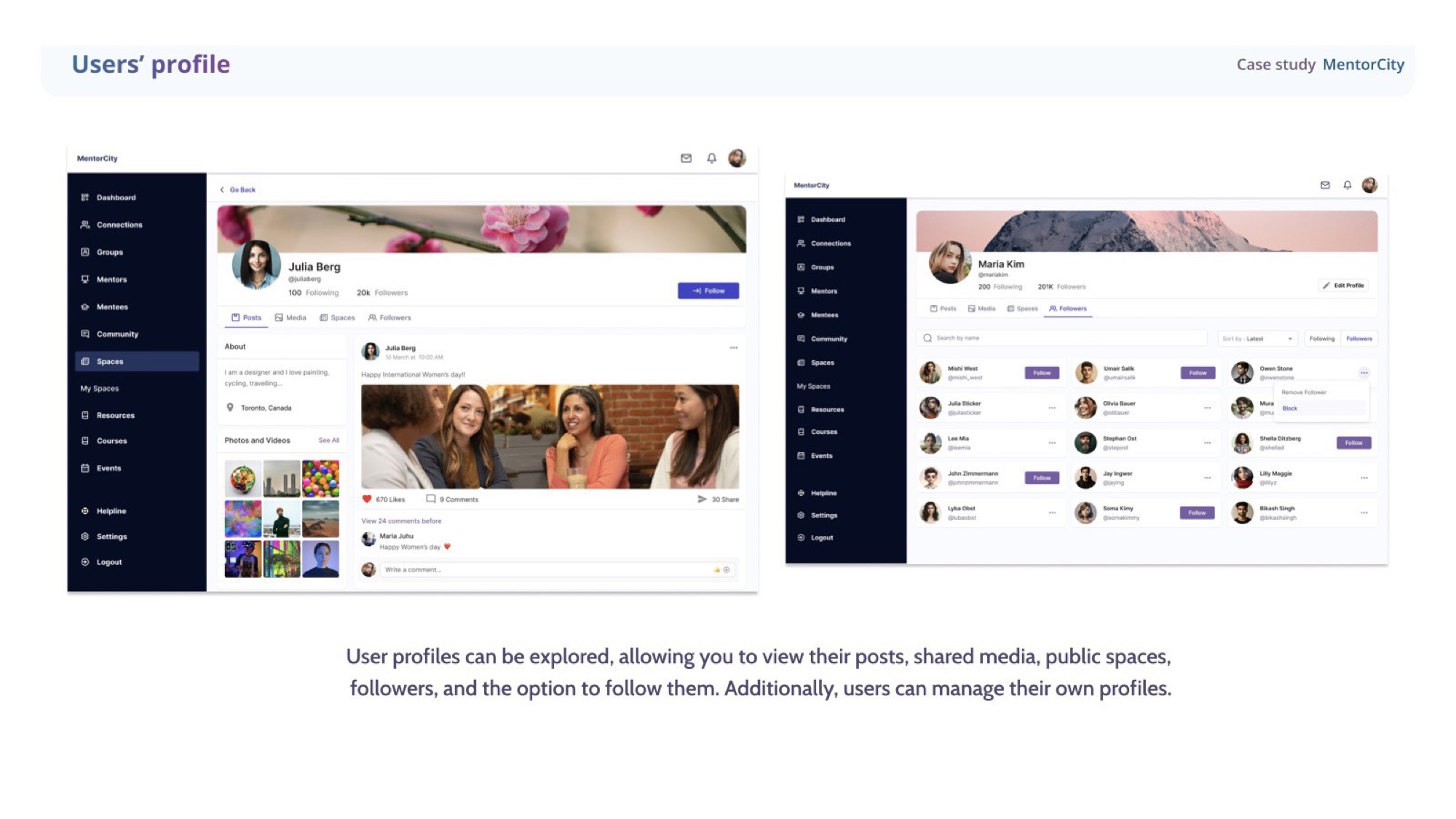
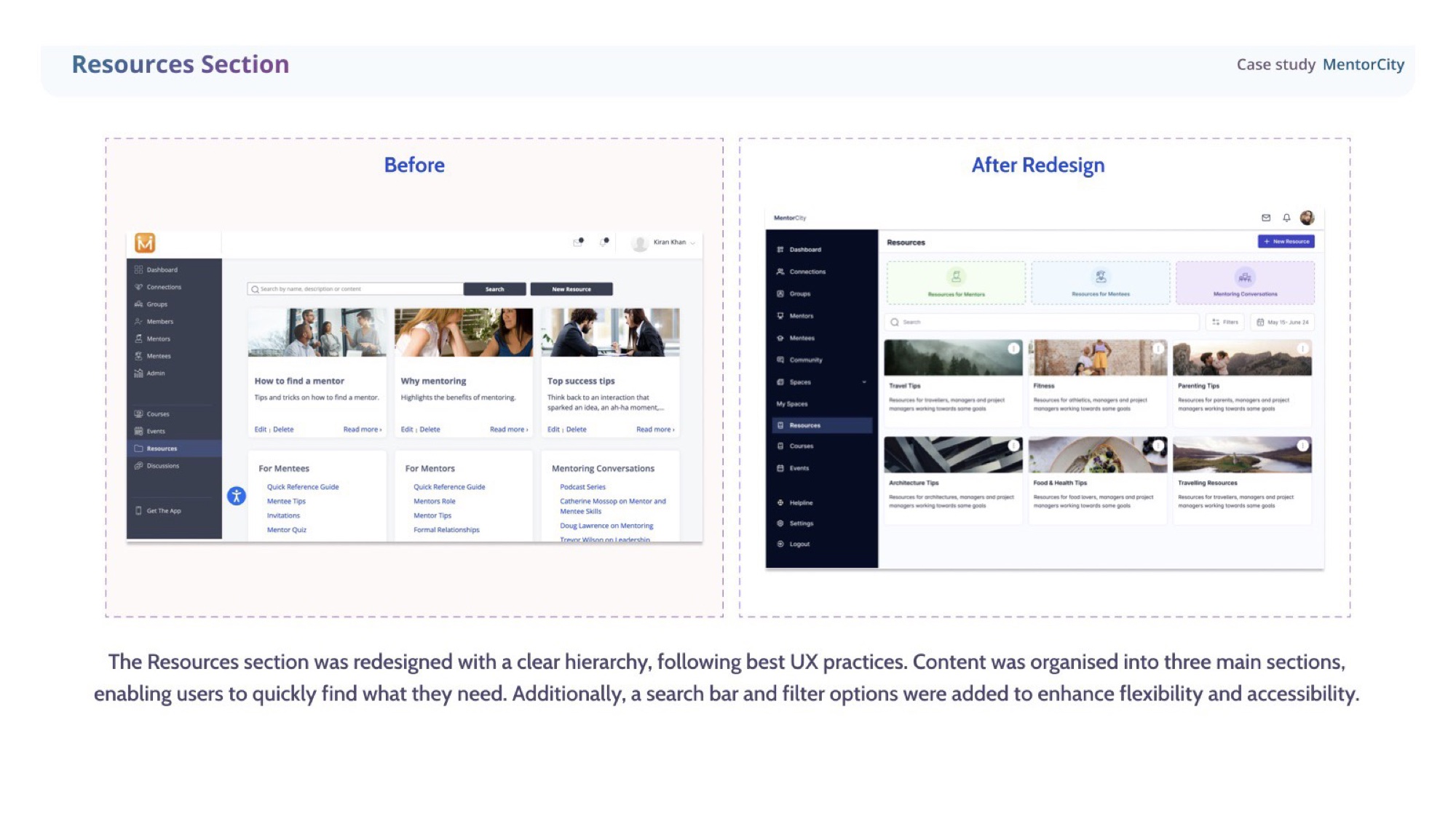
User profile & Resources
Discoverability across the platform.
User profiles became browsable — posts, shared media, public spaces, followers, the option to follow. The Resources section was rebuilt with a clear hierarchy, three sections, and a search-first layout with filters so users find what they need quickly.
UI principles
Six rules the whole platform now runs on.
Six principles emerged from the redesign — distilled, then applied back across every surface so the v2 release felt like one product, not patched modules.
Clear hierarchy
Each surface is divided into three distinct categories with their own purpose — straightforward navigation, less cognitive load.
Language accessibility
English and French tabs throughout the platform, so users can switch fluidly. Built into the form architecture itself, not a translation patch.
Visual consistency
Buttons, colours, typography — all systemised. Every screen feels like part of the same product because it is.
Flexibility & control
Role assignment, search rules, profile visibility — users have control over how the platform behaves around them.
Accessible actions
Primary actions like Save as draft and Update fields stay prominent and predictable, so progress never feels at risk.
Form organisation
Descriptive labels, placeholder text, mandatory-field indicators — designed to reduce error states before they happen.
Outcomes
What v2 shipped with.
- Social layer, launched
- New Explore Spaces, My Spaces and community feed shipped on top of the existing platform — the long-requested networking feature, finally live.
- Forms made workable
- Long, inconsistent bilingual forms restructured into a two-tab system with clear categorisation. Profile creation finally felt finishable.
- Coherent design system
- Updated the design system before the UI work began, then expanded it as features came online — engineers and designers stayed aligned across the v2 release.
- Documented hand-off
- Full specs, prototypes, and documentation handed to developers — the work survived without me in the room.
Reflection
“The brief was one feature. The work was a platform. Earning that shift in scope — and shipping it in six months — is the part I’m proudest of.”