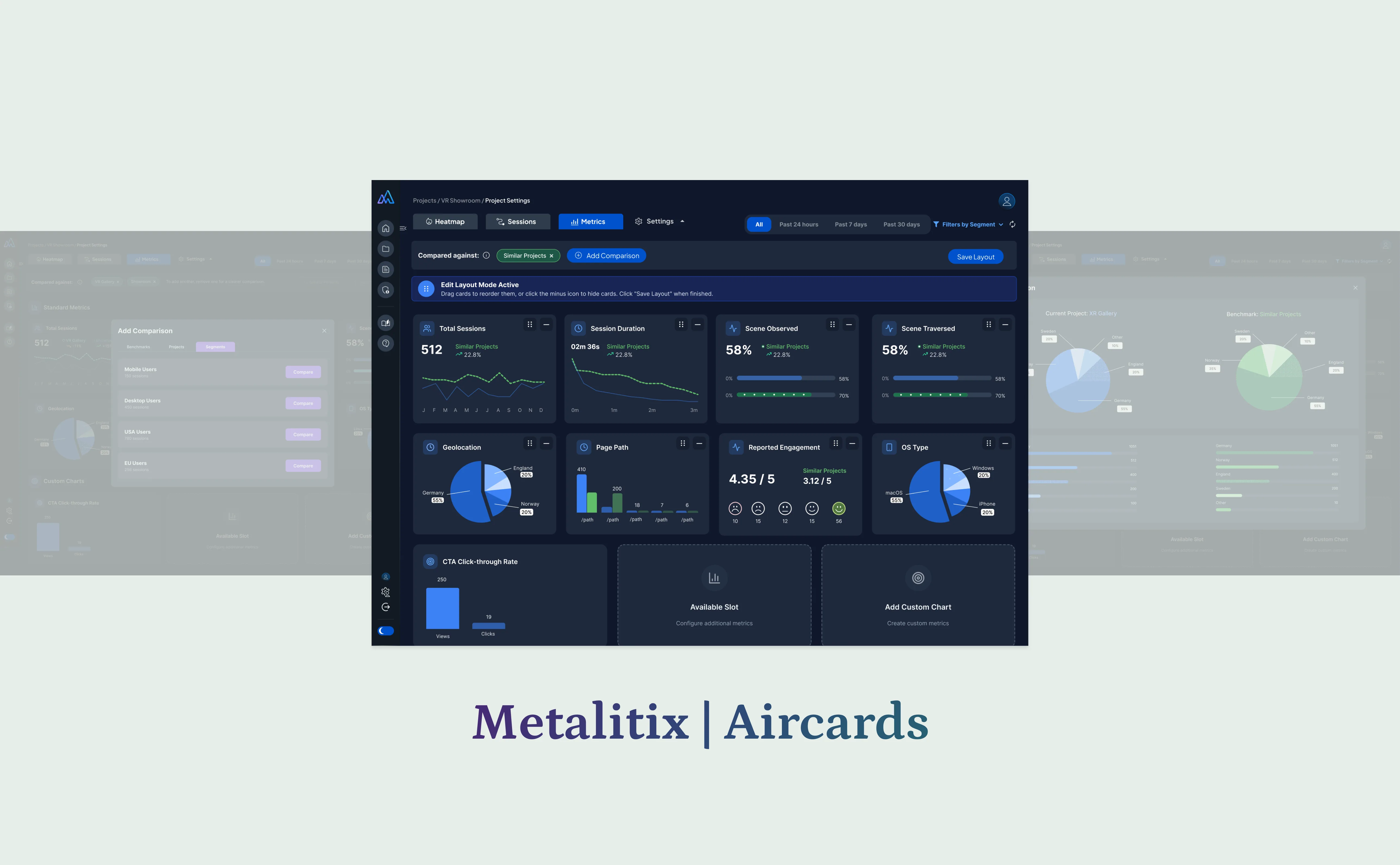
Case study · Metalitix · Aircards · 2025
Spatial analytics, redesigned.
Lead UX/UI Designer on the Metalitix Benchmark Dashboard redesign — transforming a complex, outdated analytics tool into a modern, data-driven benchmark visualisation platform for AR, VR, and 3D experiences. Three weeks, end-to-end.
- Role
- Lead UX / UI Designer
- Client
- Metalitix · Aircards
- Year
- September 2025
- Duration
- 3 weeks · one-time project
About Metalitix
How users move inside virtual worlds.
Metalitix is an immersive analytics platform that tracks and visualises user behaviour inside AR, VR, and 3D environments. It helps teams understand how users move, interact, and engage within virtual experiences — surfacing session metrics, heatmaps, scene activity, and performance insights.
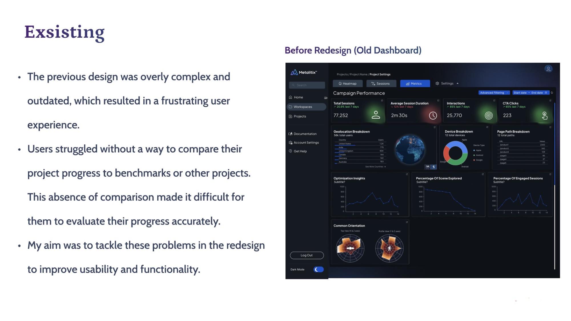
The challenge
Complex data, unreadable dashboard.
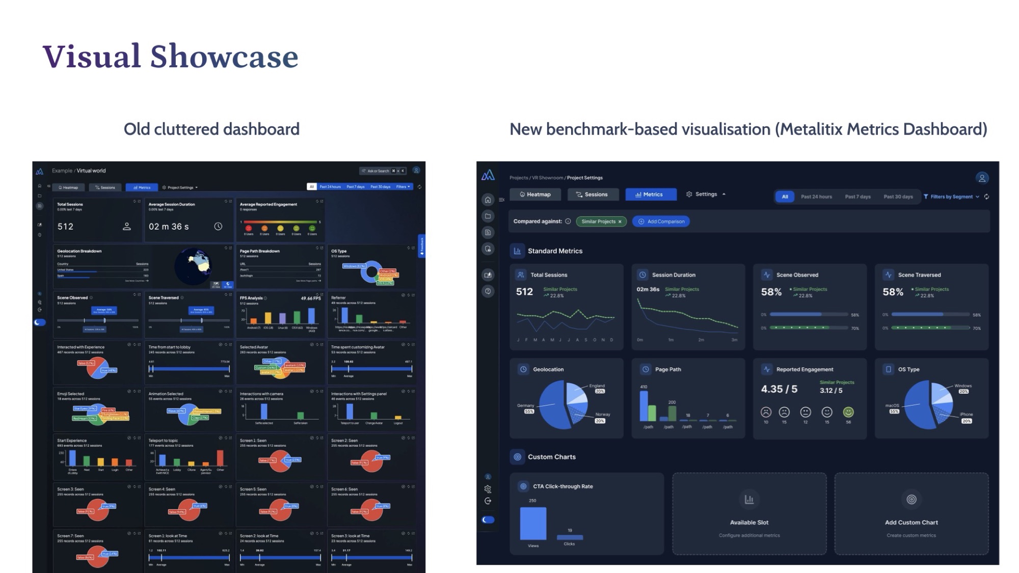
The previous dashboard was overly complex and outdated. Users had no way to compare project progress to benchmarks or other projects — making it almost impossible to evaluate performance accurately.
Old design was cluttered, inconsistent, and difficult to interpret.
Users struggled to compare key metrics across projects.
Data visualisation lacked hierarchy, accessibility, and clarity.
Before
The dashboard as it was.
The existing UI was light-themed, dense with controls, and forced users to remember context rather than read it on the page. No comparative view, no benchmarks, no hierarchy.
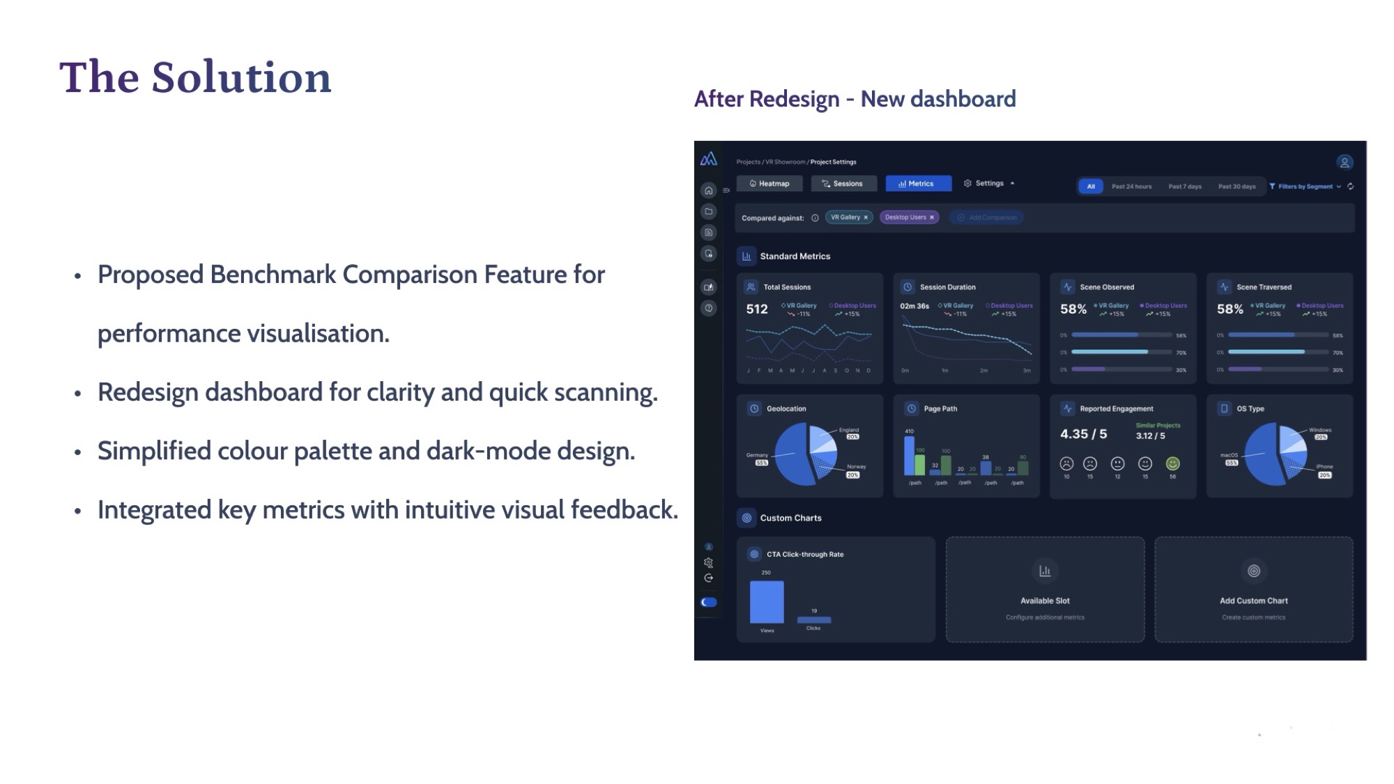
The solution
Dark-mode, benchmark-first.
Proposed a Benchmark Comparison feature so users can see their performance against other projects at a glance. Redesigned the dashboard for clarity and quick scanning, simplified the colour palette, and switched to a dark-mode treatment that gives data the spotlight.
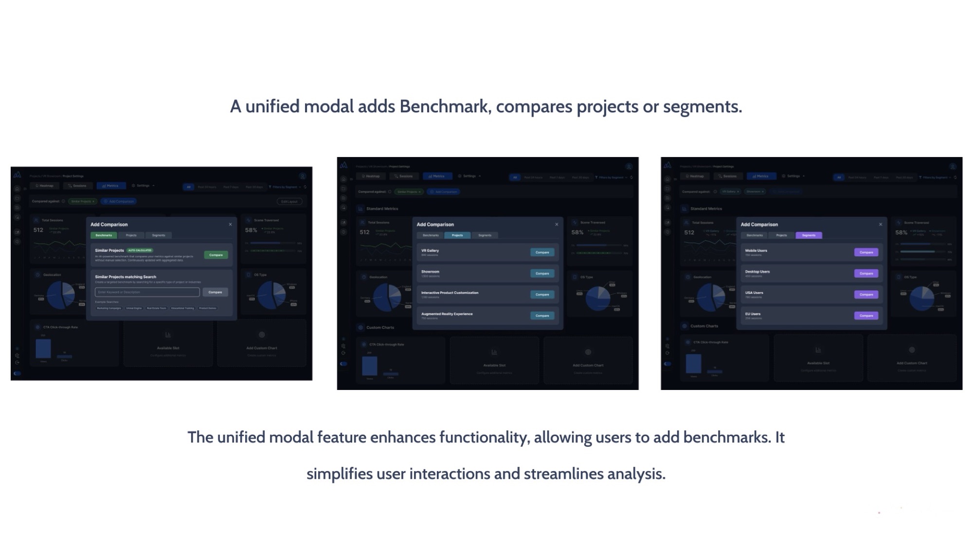
Unified modal
Add benchmarks. Compare segments.
A single unified modal pattern handles benchmark addition and project / segment comparison. One interaction model, multiple analytical tasks — simpler UI, faster analysis.
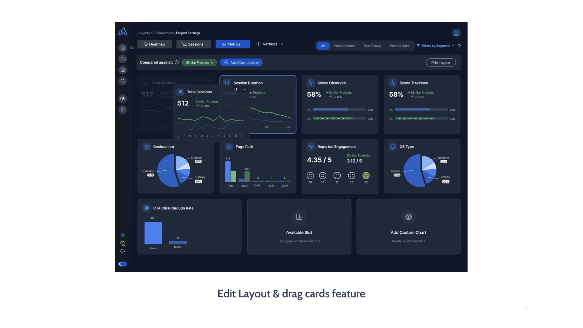
Edit layout
A dashboard each team makes their own.
Drag-and-drop card editing lets each team prioritise the metrics that matter to their immersive experience. Personalisation without engineering bottlenecks.
Key improvements
Four metrics moved.
Cognitive load
Simplified layout and improved hierarchy reduced the effort needed to read the dashboard.
Insight generation
Benchmark visuals and trend indicators help users see what changed at a glance.
Component system
Reusable design components and flexible chart modules built for future expansion.
Collaboration
Improved collaboration between design, engineering, and data-science teams.
Visual showcase
Side by side.
Impact & outcome
A new internal benchmark for UI.
The redesign was highly appreciated by the leadership team and set a new internal benchmark for UI standards.
The updated interface improved user satisfaction and decision-making speed across teams.
The new design system accelerated future feature development — every subsequent surface launched faster on the same component grammar.